
Human-centred design: a reflection in 7 diagrams
Aug 01, 2020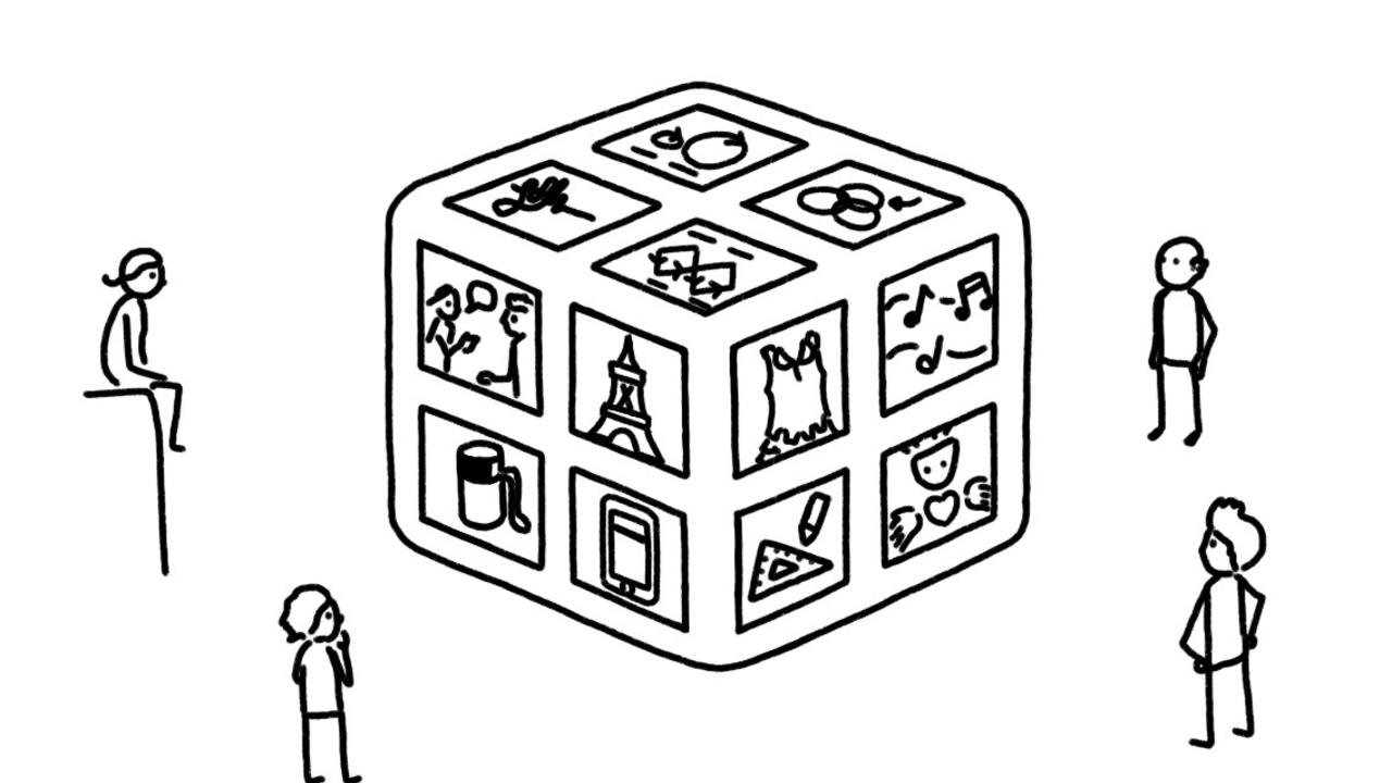
By Justin Cheong
People I’ve encountered who work in Human-Centred Design — whether that’s UX, service design, etc — have typically made their way into a design career through windy roads, thus bringing with them different approaches to problems and even different views of what design is really about.
This article contains reflections about design that emerged in my time collaborating with one such designer. In our time working together in an in-house consulting unit, we conducted design research, ran workshops, built design capability, and reflected on our practice together. Time after time, we found it helpful to use visuals and metaphors to find common ground in our description of design.
The following are 7 of those visuals and metaphors that together paint a picture of how we came to see design.
1 – Design looks different to everyone

Imagine if design were an infinitely large house, and everyone who tried to look into the house only saw one part of it through a single window.
This describes the experience of trying to describe design, and getting different descriptions from different people. Some people look into the “house of design” and see architecture and built form, while others see apps and software. Some designers describe the design process using a “double diamond”, while others describe it with a Venn diagram.
When you zoom out from your own window and look around you, it becomes obvious why everyone sees design differently — there are no universal truths here. Design is experienced in the context of infinitely varying human perception, experience and memory.
Naturally, the reflections in this article are also just singular views into the house of design.
2 – Design conveys the intent of change we want to create for others

For the most part, design is an expression of our intent, and specifically our intent to create change for others.
As designers, we measure our impact by the change that we create in people’s lives. Sometimes we measure this change with quantities or metrics, and we do so by looking at changes in behaviour. However, we also know intuitively that some of this change is deeply embedded and not feasible to measure in the observable world.
Given the intent we have as designers, our design work is only as good as the change that it creates for other people. In practice, it is vital to involve those people as much as possible, to both define and to observe this change.
3 – Design tools are only as useful as they create a change in mindset

To achieve our goals, we designers have been blessed with many tools for change, most of which are intuitive, widely available and have even become popular in organisations.
However, this availability has come at a cost; design tools have also been widely used to reinforce existing ways of working, and on a deeper level, personal agendas and biases. And it is not always designers doing this — design tools have been used varyingly by consultants, business analysts, marketing departments, branding agencies and so on.
Examples of this issue:
- Doing research as a checkbox item. E.g. Commissioning research only to reinforce what was already planned, and not allowing room for surprise.
- Using “Minimum Viable Product” only as a reason to build a product cheaply, rather than as an approach to learning. E.g. Ceasing additional funding for an MVP the moment it launches.
- Conducting workshops to reinforce pre-determined agendas, rather than as a space for emergent outcomes. E.g. A “co-design workshop” that presents participants with pre-decided, fully formed concepts.
When a design tool fails to change the way we approach problems, it risks failing to create any change at all.
4 – A “design process” is a virtuous cycle between reflection and action

How do you do design well?
Over recent years, we’ve had many attempts at describing an “optimal” design process. Mostly, they’ve been diagrams showing ways to get from discovery to implementation, over a set period of time.
The challenge is, while time moves forward linearly, the design “process” does not. It goes back and forth.
What’s important is oscillation — maintaining a virtuous cycle between action and reflection. The goal of any action is to explore and create, and the goal of any reflection is to identify learnings. As long as you are executing a healthy cycle between action and reflection, you are “doing” a design process.
The action–reflection cycle can occur for different activities — e.g., research and testing — and in different sizes — e.g., one cycle can be as small as days or hours, or as large as months or years.
5 – Collaboration comes before design

Effective collaboration has to be established before effective design can happen. When the groundwork of collaboration is not done, you risk any subsequent design work being misused, misinterpreted or dismissed.
You’ll know you don’t have an effective collaboration set up when you are having the same conversations over and over. This is the pattern of dissonance.
The collaborative consonance framework, as described by Collabforge, asks us to consider the shared understanding, vision, plans and outcomes we have when we are trying to reach a state of effective collaboration. Practically, this means every person in a team should know everyone else’s answer to the question: “What do you personally want to get out of this project?”
It also means being okay with this stage of formation taking weeks or months — or even being a continuous process — as this is naturally how long it takes for people to get to know one another and to understand each other’s intents.
6 – Your design is only as good as your persuasion

Change is created through influence. An argument is a unit of influence, and a strong argument needs to be designed as much as anything else.
Aristotle gave us a handy heuristic for thinking about how to design an argument. He described the modes of persuasion, where sufficient attention should be paid to logos (the essence of your idea), pathos (the relatability of your message) and ethos (the authority that you hold).
Commonly, designers only focus on conveying the essence of their idea (logos) to others and become frustrated when their ideas are not fully adopted. This model reminds designers of the elements of persuasion, so that we can more effectively appeal to our audiences and have a better chance at influencing change.
7 – Design involves exercising your head, heart and hands

To design holistically is to exercise all three of these faculties — head, heart and hands. In this metaphor, each body part represents an aspect of design:
Head refers to the value of adopting diverse mindsets in approaching a problem. Mindsets are many and varying: Divergent and convergent, generating and evaluating, conceptual and practical, zoomed in and zoomed out, and so on.
Heart refers to being curious about people. Tapping into this curiosity means stepping into other people’s worlds whenever possible, and bringing them into our design work rather than designing things in isolation for them.
Hands refers to having a toolkit of activities, methods and techniques to achieve desired outcomes. The more tools we have available to us, the more situations we can express our intent through design to effect change.
Design looks different to everyone, and these seven reflections capture what they look like to me at this moment in time. They are my go-to’s — diagrams included — when I describe design to people who want to learn more about design.
The above diagrams are a bit more conceptual than concrete, a bit more imaginative than literal.
What about you? What do you see when you look into the “house of design”? And how would you draw that?
This article is dedicated to the time Will Farrier and I spent together cracking problems, designing solutions and creating change at a large corporate. Thanks Will, for a brilliant year.
This article was originally published on UX Collective here.